|
|
Portraiture
by Sarah Fox
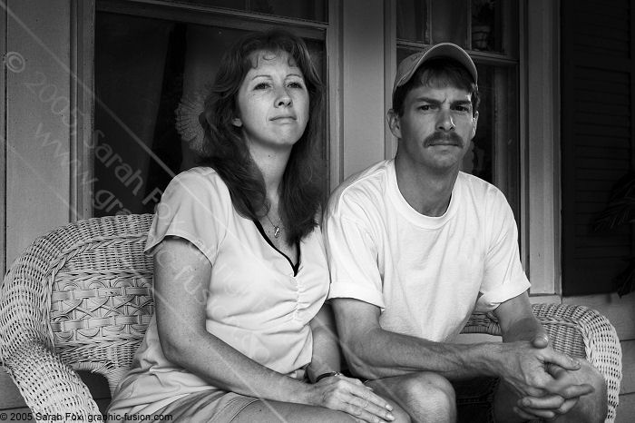
  One of the things I most enjoy is portraiture. The thing is, though, I don't do it like most photographers. I strive to give my clients something different -- something that departs from the worn out formulas of traditional studio photography. Above all, it is essential to me to portray people the way they really are -- despite themselves and despite their dogged insistance of baring their teeth and stiking poses. That's a hard trick, but it's something I do well. Why is this so important to me? Very simply, I want the person I photograph to be the same person others know. When people look at the photograph years or decades from now, I want them to say with a smile, "Yeah, that's Sue alright!" After all, how many photographs do we accumulate throughout our lives, whether snapshots or professional portraits, that show us grinning and posing -- hollow, empty shots in front of trees and rocks we don't even remember? Do any of those photographs stand out as special? Of course not. In the end, the photograph that matters is the one that's genuine -- true to character. It is my hope that the genuine photograph that has real meaning to future generations will be one that I took. One of the things I most enjoy is portraiture. The thing is, though, I don't do it like most photographers. I strive to give my clients something different -- something that departs from the worn out formulas of traditional studio photography. Above all, it is essential to me to portray people the way they really are -- despite themselves and despite their dogged insistance of baring their teeth and stiking poses. That's a hard trick, but it's something I do well. Why is this so important to me? Very simply, I want the person I photograph to be the same person others know. When people look at the photograph years or decades from now, I want them to say with a smile, "Yeah, that's Sue alright!" After all, how many photographs do we accumulate throughout our lives, whether snapshots or professional portraits, that show us grinning and posing -- hollow, empty shots in front of trees and rocks we don't even remember? Do any of those photographs stand out as special? Of course not. In the end, the photograph that matters is the one that's genuine -- true to character. It is my hope that the genuine photograph that has real meaning to future generations will be one that I took.
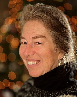
  I also realize that many people do want posed shots. I do those too, although I try to be a bit different about how I do them. I don't want my portraits to look like everyone else's. For instance, consider the portrait to the left, of Earline Thomas (my co-conspirator in art). I know her very well, and this is very typical of the warmth she radiates. However, it is definitely a posed shot. What is different is my use of a very large aperture on a beautiful portrait lens (the EF 100 f/2.0) to create the dappled highlights from the lights behind her. I've also thrown some rim lighting on her hair to give the image some life. I also realize that many people do want posed shots. I do those too, although I try to be a bit different about how I do them. I don't want my portraits to look like everyone else's. For instance, consider the portrait to the left, of Earline Thomas (my co-conspirator in art). I know her very well, and this is very typical of the warmth she radiates. However, it is definitely a posed shot. What is different is my use of a very large aperture on a beautiful portrait lens (the EF 100 f/2.0) to create the dappled highlights from the lights behind her. I've also thrown some rim lighting on her hair to give the image some life.
I should also explain what I don't do as a photographer. Many people may remember the cliché Glamour Shots portraits of the the late 1980's and early 1990's. Most of us have seen them hanging in people's homes. Fortunately most Glamour Shots victims have had the sense to hide the evidence or throw it out. The thing about these portraits is that they all look the same. Check out this "Children of the 90's" blog about it, complete with illustrations. (Be sure to read, and not just look. It's funny!) I've also seen countless "high key" shots (overly bright and devoid of detail), as those are not too demanding of equipment or technical competence. And then there are the tilted shots that seem to have been all the rage. The tonier photographers are now cloaking their subjects in hoods and turning them into dark, mysterious characters. These are all fads, and I don't dabble in fads. I guarantee they will all look awful 20 years from now. I strive for originality and timelessness in every image I create.
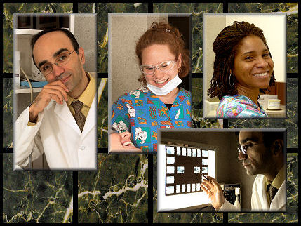
  Another way I differ from a studio photgrapher is that my lighting is completely portable and considerably more flexible and elaborate. This gives me the ability to take my "studio" on-location for commercial work. (You can read more about my unique on-location capabilities here.) An example of my commercial on-location work is this shoot I did for a dentist and his staff for his web page revision, following the purchase of the practice from another dentist. Another way I differ from a studio photgrapher is that my lighting is completely portable and considerably more flexible and elaborate. This gives me the ability to take my "studio" on-location for commercial work. (You can read more about my unique on-location capabilities here.) An example of my commercial on-location work is this shoot I did for a dentist and his staff for his web page revision, following the purchase of the practice from another dentist.
During the preparation of my work product, the dentist expressed that he liked the previous dentist's main page graphic, which had a few photographs hovering over some solid gray squares with lavender drop shadows. So as to give this dentist a more attractive graphic to insert seamlessly into the pre-existing website, I floated a few of the images I had taken over an array of marble squares, which was more in keeping with the architecture of his office. He did see that as a substantial improvement. Here, as with other commercial work, the end objective wasn't to be "genuine," from an artistic sense, so much as to convincingly convey a favorable impression of the practice. My goal on this shoot was to convey precision and technical competence on the part of the dentist (sharp short-lighting of dentist's face as he analyzes some x-rays), combined with a pleasant and relaxing patient experience with a friendly staff (e.g. the smiling patient and assistant in the middle photo). I think I succeeded.
  The most challenging aspect of the dental shoot was the tiny working areas, which were about the size of office cubicles. I made extensive use of reflective panels and tarps, which could be draped over cabinets. I cannot display the prior dentists' photographs here because I am not the copyright holder; however, I am happy to email images from the prior website upon request, so as to illustrate the extraordinarily challenging shooting environment and the previous (professional) photographer's failure to generate a favorable work product. The most challenging aspect of the dental shoot was the tiny working areas, which were about the size of office cubicles. I made extensive use of reflective panels and tarps, which could be draped over cabinets. I cannot display the prior dentists' photographs here because I am not the copyright holder; however, I am happy to email images from the prior website upon request, so as to illustrate the extraordinarily challenging shooting environment and the previous (professional) photographer's failure to generate a favorable work product.
Again, my style of portraiture is not for everyone. Some people simply want to dress up in their Sunday best, stand in front of a dappled blue backdrop, say "cheese," and have a picture snapped. That's not what I do. If you're interested in something more imaginative and timeless, and especially if you're a commercial client who would benefit greatly from professional, on-location photography, please contact me to book a shoot.
Links:
Home
Galleries
About Us
Photoediting Services
On-Location Services
Portraiture
Architectural Photography
Commercial Photography
Special Events
Web Design
Articles
Projects
FAQ
Contact
Site Map
Notice: All images and web content are copyrighted by Sarah Fox, Earline Thomas, and/or Graphic Fusion, will all rights reserved.
Printing or distribution of this material is prohibited.
|

